
Week 5 Assignment
IDD
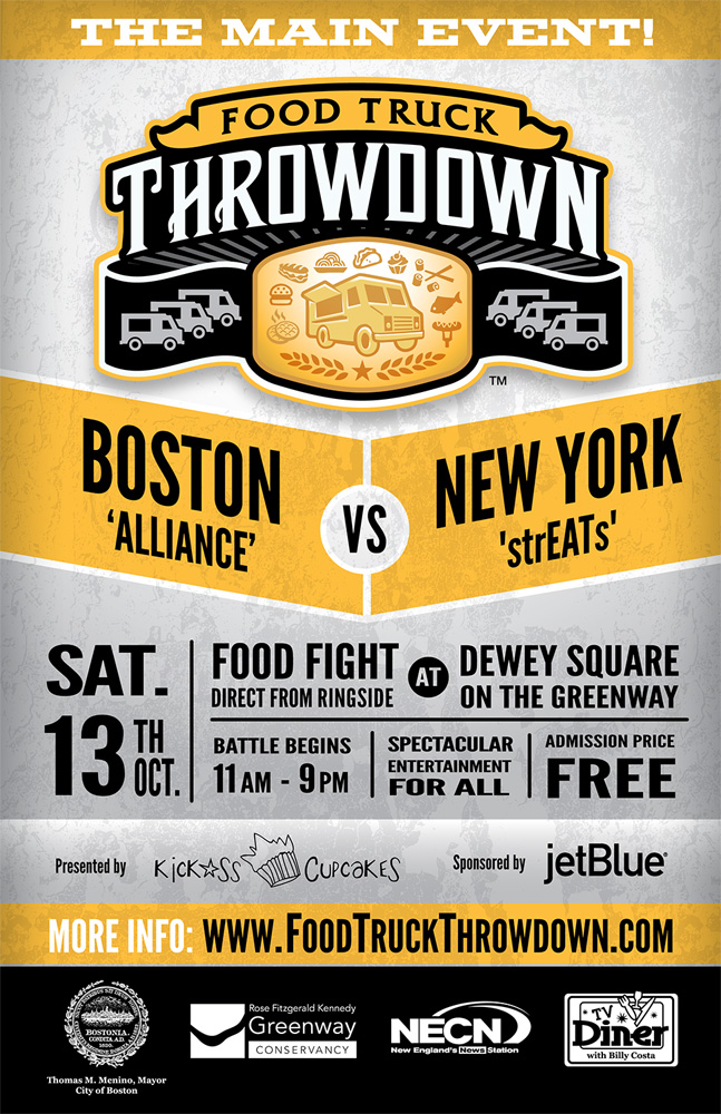
Assignment: Event Poster
Rubric
Below is the rubric for the assignment. The total point value is 120 pts, with each set of criteria worth 20 points.
| 5 (50 pts) | 4 (40 pts) | 3 (20 pts) | 2 (10 pts) | 1 (0 pts) | |
|---|---|---|---|---|---|
| Letterforms: A clean design with easily recognizable letterforms and positive letter spacing enhances the visual appearance. Choose complimentary typefaces with good readability. No more than three typefaces are used. | The typefaces chosen are easy to read. They are not kerned too tight/loose. The leading isn't too large so that it is disconnected or too small that the ascending and descending letters are touching. The tracking isn't set, so there is too much spacing between the letters and words. Or too little space that everything is too close together. | The typefaces chosen are easy to read, and the kerning, leading, and tracking are correct. Some text contains widows and or orphans. | The typefaces chosen are difficult to read. Ascending or descending letters are touching. Kerning is too tight or too loose. Excessive widows or orphans. Too many fonts are used. | Document used headline typefaces for body copy. Ascending or descending letters are touching. Kerning is too tight or too loose. Tracking is set incorrectly. Excessive widows or orphans. Too many fonts are used. | The content was not legible. |
| Typographical Hierarchy: The document shows the reader which information to focus on, which is most important, and which supports the main points. | The document contains headlines that are clearly recognizable. The document contains varying weights and sized text. There is chunking used, and items are connected. | The document contains headlines that are clearly recognizable. No chunking is used. The document contains varying weights and sized text. | The document doesn't flow very well and lacks variety in typeface sizes. | No variety of typeface size or weight. Chunking is not present. | No formatting is present. |
| Imagery: The document contains at least one high-resolution photo or illustration that enhances the overall look of the poster while helping to illustrate what the event is. | Images are colorful and appropriate to the topic. The layoutflows well, shows creativity, and is pleasing to the eye. The image is high resolution and contains no defects. | Images are primarily colorful and appropriate. The layout may show some creativity but is not organized logically or cluttered. | Images are inappropriately sized or lack resolution. Images are not appropriate for the topic. | Images are inappropriately sized or lack resolution. The layout is cluttered or unorganized. Images are not appropriate for the topic. | No images or artwork are included. |
| Content: The poster contains name, date, time, and place of the event as well as a description of the event. Must include how to register, sign up or buy tickets as well as cost. | The poster contains all the necessary information and also includes a website address and parking information. | The poster contains all the necessary information. | The poster contains most of the necessary information. | The poster missing most of the necessary information. | The poster is missing date, time or place. |
| Production Quality: The poster is an 11-inch wide by 17-inch, high-resolution, press-ready PDF in CMYK color format. It contains crop marks and bleeds when appropriate. | The document can be taken to a commercial printer without any defects or issues. | The document is missing cropmarks or bleeds. | The document is RGB. | The document is RGB. The document is missing cropmarks or bleeds. | The document is the wrong size and contains numerous defects. |
| Overall Design: The poster is attractive and contrasts the background and text properly. Typeface choices match the style of the overall design. Design is appropriate for the audience. | The poster is aesthetically pleasing. The student has chosen typefaces and design choices that appeal to the audience of the event. There is proper contrast. | The poster is attractive and the typefaces work however contrast needs to be improved. | The poster is attractive, contrast is good but the typefaces and overall style do not work with the audience. | Design does not have proper contrast, typefaces and design do not work for the audience and color choices clash or do not work well together. | The poster lacks design. |
Discussion Prompt
- Explain what the event is and who is the demographic for your event.
- Once you have completed this step, please reply to two of your peers, providing them with useful, constructive feedback. Please be kind.
- Example of good feedback: Your design is very pretty, but the text is too small for the address. Your headline is very bold and easy to read, but the font is too difficult to read for body copy.
- Bad Examples: I like your design; it is very nice. Your design is poorly executed.
Rubric
The discussion is worth 20 points, with each set of criteria worth 5 points.
| Present (10pts) | Minor Revision (6pts) | Major Revision (4pts) | Major Revision (2pts) | Not Present (0pts) | |
|---|---|---|---|---|---|
| Student uploaded graphic | Jpeg was uploaded into Padlet | Graphic was a link | Graphic was not a jpeg | Image was broken | No image present. |
| Student explained the event | Student's explanation was well thought out and written using concise, direct language. Post uses vocabulary from the class. | The student explained the event, but it was confusing and lacked terminology from the class. | Student's explanation was lacking detail. | Student's post contained misspellings and poor grammar. | No post present. |
| Student explained the demographic | Student's explanation was well thought out and written using concise, direct language. Post uses vocabulary from the class. | Student explained the demographic but it was confusing and lacked terminology from the class. | Student's explanation was lacking detail. | Student's post contained misspellings and poor grammar. | No post present. |
| Student provided feedback to two peers | Student provided useful feedback for two people. | Student provided useful feedback for one people. | Student provided feedback but it was no useful. | Student's post contained misspellings and poor grammar. | No post present. |